DISCOUNT TIRE · ENTERPRISE E-COMMERCE
Checkout Redesign
A more intuitive checkout journey designed to build confidence and improve conversion.
A more intuitive checkout journey designed to build confidence and improve conversion.
$57M+
$57M+
annualized revenue impact
+230K
+230K
Annualized Unit Lift
Lead UX
Lead UX
research, product strategy, flows & experimentation
01 / SCHEDULE

02 / CUSTOMER INFO

03 / PAYMENT

THE CHALLENGE
Business need
Business need
Year-over-year data showed declining step conversion within the checkout funnel, creating a growing risk to overall purchase completion. After two previous tests failed to improve performance, the business needed a stronger approach grounded in customer behavior and conversion data.
Customer experience problem
Customer experience problem
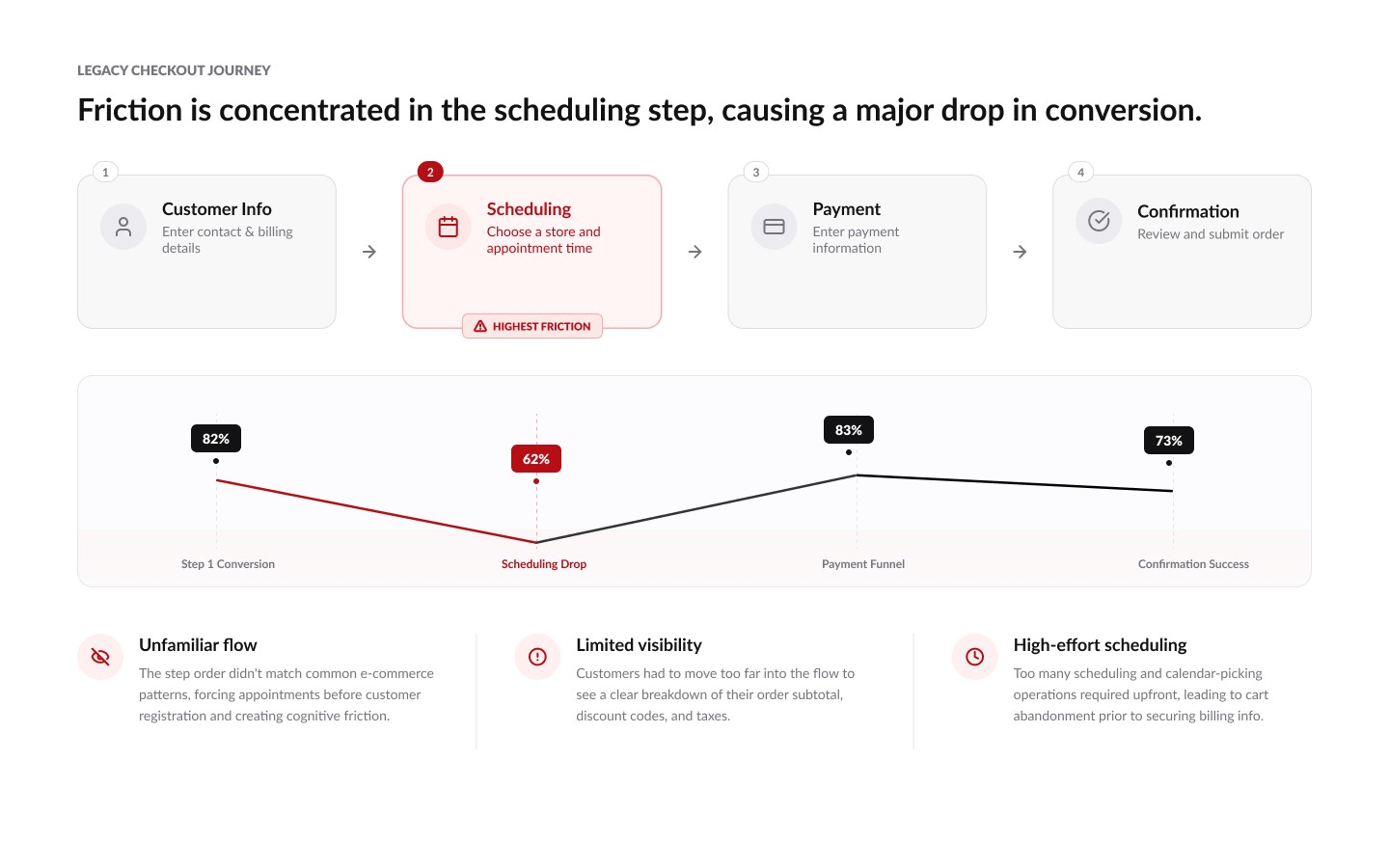
The existing flow didn’t align with common e-commerce patterns customers already understood. Limited visibility into their purchase and an unintuitive step order added friction, making it harder to confidently move from tire selection to installation.

RESEARCH PHOTO PLACEHOLDER
RESEARCH PHOTO PLACEHOLDER
LISTENING TO CUSTOMERS - UXR
100+ conversations and survey responses reframed the work.
100+ conversations and survey responses reframed the work.
Moderated and unmoderated research revealed where uncertainty was entering the checkout experience—and the patterns customers relied on to feel confident moving forward.
01 — Consistency builds confidence
Customers responded more positively when Cart and Checkout felt visually consistent and predictable. Reducing friction between the two helped users move forward with greater confidence
02 — Installation fees created hesitation
“Installation & Life of Tire Maintenance” repeatedly caused confusion across multiple research studies. Customers questioned both the charge and what was included, creating hesitation during checkout.
03 — Order details needed to stay visible
Customers frequently missed collapsed order summaries. Keeping product, pricing, and order details visible made it easier to verify their purchase and confidently continue.
Three moves made the experience feel inevitable
Research revealed three opportunities to rethink checkout
Research revealed three opportunities to rethink checkout
01
Bring scheduling forward
Move the highest converting step earlier in the journey, establishing installation intent before collecting customer information
02
Make order details visible
Keep products, pricing, installation details, and totals within reach so customers can verify their purchase without leaving the flow
03
Design around familiar patterns
The first two tests didn't win. They showed us why
Three experiments progressively challenged our assumptions, using each result to inform the next iteration
EXPERIMENT 01
Currently XT with Two-Column
We introduced a familiar two-column checkout structure, but the new layout alone didn’t improve conversion.
EXPERIMENT 02
Order Details
Visibility helped, but customers were still questioning their purchase and installation commitment.
EXPERIMENT 03 · WINNER
Rethink the whole journey
We combined the strongest ideas from previous tests with a larger change: moving the highest-converting scheduling step forward and creating a more familiar, transparent checkout experience.
BUSINESS IMPACT
$50M+
$50M+
in annualized revenue impact.
in annualized revenue impact.
Research → Strategy → Experimentation → Impact. A high-stakes checkout became easier to understand, easier to complete, and easier to scale.
FINAL EXPERIENCE
See the redesigned checkout in action
From scheduling through payment, the final experience brings the redesigned flow together into one clearer, more consistent checkout journey.
DISCOUNT TIRE · ENTERPRISE E-COMMERCE
Checkout Redesign
A more intuitive checkout journey designed to build confidence and improve conversion.
A more intuitive checkout journey designed to build confidence and improve conversion.
$57M+
$57M+
annualized revenue impact
+230K
+230K
Annualized Unit Lift
Lead UX
Lead UX
research, product strategy, flows & experimentation
01 / SCHEDULE
02 / CUSTOMER INFO
03 / PAYMENT
THE CHALLENGE
Business need
Business need
Year-over-year data showed declining step conversion within the checkout funnel, creating a growing risk to overall purchase completion. After two previous tests failed to improve performance, the business needed a stronger approach grounded in customer behavior and conversion data.
Customer experience problem
Customer experience problem
The existing flow didn’t align with common e-commerce patterns customers already understood. Limited visibility into their purchase and an unintuitive step order added friction, making it harder to confidently move from tire selection to installation.
RESEARCH PHOTO PLACEHOLDER
RESEARCH PHOTO PLACEHOLDER
LISTENING TO CUSTOMERS - UXR
100+ conversations and survey responses reframed the work.
100+ conversations and survey responses reframed the work.
Moderated and unmoderated research revealed where uncertainty was entering the checkout experience—and the patterns customers relied on to feel confident moving forward.
01 — Consistency builds confidence
Customers responded more positively when Cart and Checkout felt visually consistent and predictable. Reducing friction between the two helped users move forward with greater confidence
02 — Installation fees created hesitation
“Installation & Life of Tire Maintenance” repeatedly caused confusion across multiple research studies. Customers questioned both the charge and what was included, creating hesitation during checkout.
03 — Order details needed to stay visible
Customers frequently missed collapsed order summaries. Keeping product, pricing, and order details visible made it easier to verify their purchase and confidently continue.
Three moves made the experience feel inevitable
Research revealed three opportunities to rethink checkout
Research revealed three opportunities to rethink checkout
01
Bring scheduling forward
Move the highest converting step earlier in the journey, establishing installation intent before collecting customer information
02
Make order details visible
Keep products, pricing, installation details, and totals within reach so customers can verify their purchase without leaving the flow
03
Design around familiar patterns
The first two tests didn't win. They showed us why
Three experiments progressively challenged our assumptions, using each result to inform the next iteration
EXPERIMENT 01
Currently XT with Two-Column
We introduced a familiar two-column checkout structure, but the new layout alone didn’t improve conversion.
EXPERIMENT 02
Order Details
Visibility helped, but customers were still questioning their purchase and installation commitment.
EXPERIMENT 03 · WINNER
Rethink the whole journey
We combined the strongest ideas from previous tests with a larger change: moving the highest-converting scheduling step forward and creating a more familiar, transparent checkout experience.
BUSINESS IMPACT
$50M+
$50M+
in annualized revenue impact.
in annualized revenue impact.
Research → Strategy → Experimentation → Impact. A high-stakes checkout became easier to understand, easier to complete, and easier to scale.
FINAL EXPERIENCE
See the redesigned checkout in action
From scheduling through payment, the final experience brings the redesigned flow together into one clearer, more consistent checkout journey.
DISCOUNT TIRE · ENTERPRISE E-COMMERCE
Checkout Redesign
A more intuitive checkout journey designed to build confidence and improve conversion.
A more intuitive checkout journey designed to build confidence and improve conversion.
$57M+
$57M+
annualized revenue impact
+230K
+230K
Annualized Unit Lift
Lead UX
Lead UX
research, product strategy, flows & experimentation
01 / SCHEDULE
02 / CUSTOMER INFO
03 / PAYMENT
THE CHALLENGE
Business need
Business need
Year-over-year data showed declining step conversion within the checkout funnel, creating a growing risk to overall purchase completion. After two previous tests failed to improve performance, the business needed a stronger approach grounded in customer behavior and conversion data.
Customer experience problem
Customer experience problem
The existing flow didn’t align with common e-commerce patterns customers already understood. Limited visibility into their purchase and an unintuitive step order added friction, making it harder to confidently move from tire selection to installation.
RESEARCH PHOTO PLACEHOLDER
RESEARCH PHOTO PLACEHOLDER
LISTENING TO CUSTOMERS - UXR
100+ conversations and survey responses reframed the work.
100+ conversations and survey responses reframed the work.
Moderated and unmoderated research revealed where uncertainty was entering the checkout experience—and the patterns customers relied on to feel confident moving forward.
01 — Consistency builds confidence
Customers responded more positively when Cart and Checkout felt visually consistent and predictable. Reducing friction between the two helped users move forward with greater confidence
02 — Installation fees created hesitation
“Installation & Life of Tire Maintenance” repeatedly caused confusion across multiple research studies. Customers questioned both the charge and what was included, creating hesitation during checkout.
03 — Order details needed to stay visible
Customers frequently missed collapsed order summaries. Keeping product, pricing, and order details visible made it easier to verify their purchase and confidently continue.
Three moves made the experience feel inevitable
Research revealed three opportunities to rethink checkout
Research revealed three opportunities to rethink checkout
01
Bring scheduling forward
Move the highest converting step earlier in the journey, establishing installation intent before collecting customer information
02
Make order details visible
Keep products, pricing, installation details, and totals within reach so customers can verify their purchase without leaving the flow
03
Design around familiar patterns
The first two tests didn't win. They showed us why
Three experiments progressively challenged our assumptions, using each result to inform the next iteration
EXPERIMENT 01
Currently XT with Two-Column
We introduced a familiar two-column checkout structure, but the new layout alone didn’t improve conversion.
EXPERIMENT 02
Order Details
Visibility helped, but customers were still questioning their purchase and installation commitment.
EXPERIMENT 03 · WINNER
Rethink the whole journey
We combined the strongest ideas from previous tests with a larger change: moving the highest-converting scheduling step forward and creating a more familiar, transparent checkout experience.
BUSINESS IMPACT
$50M+
$50M+
in annualized revenue impact.
in annualized revenue impact.
Research → Strategy → Experimentation → Impact. A high-stakes checkout became easier to understand, easier to complete, and easier to scale.
FINAL EXPERIENCE